Here's My Woodworking!
by Michael Oliver
Click on any picture to see a larger version.
My approach to creating furniture is just like any other woodworker: design the piece (which
includes choosing which joinery technique(s) to use, what the functionality of the piece will be,
and then the basics of allowing for movement of the wood), pick the wood(s), and then finally
build it. Sounds easy enough. To me the design portion is 70% aesthetics and 30% functionality,
and is the most fun but can also make or break the project. If you piece is fully functional but is the
homely red-headed step child, then what is the point of making it?
|
|
The design of a piece of furniture is pretty basic. It needs to hold stuff (which could be one's
self), display stuff, or maybe display nothing but look pretty darn good just being. But once you
got that down, what next? The really big and daunting question is what the heck should it look
like? One could look through furniture books or google (bing or yahoo if you prefer) furniture
design and the idea might come to you. But if one has an over-active right sided brain, the idea
might come naturally.
|
|
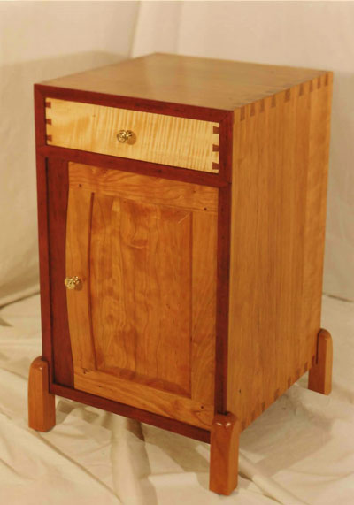
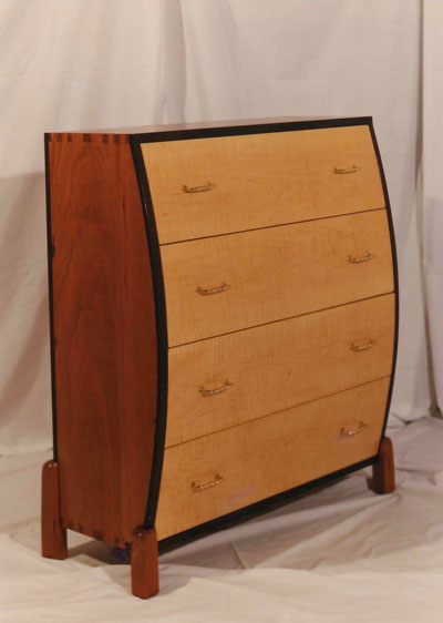
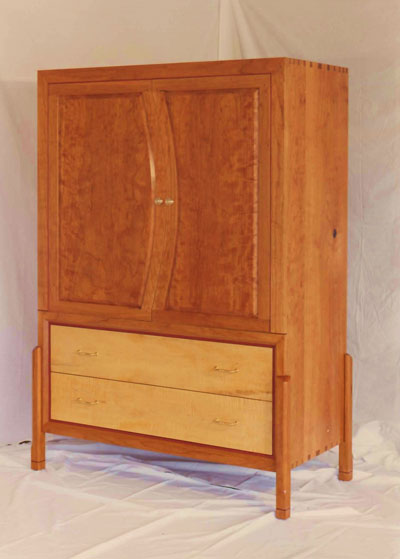
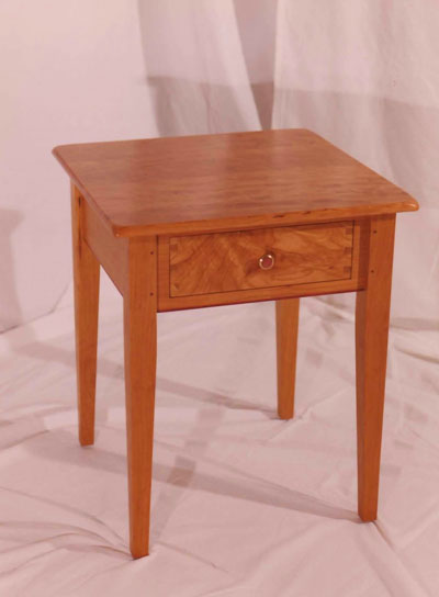
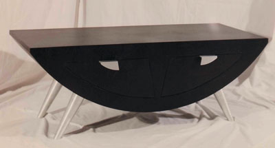
I want my furniture pieces to be different, one of a kind. I love off balance and asymmetrical
designs with a combination of both straight and curved lines. You may not agree with this style,
but that is okay because beauty is in the eye of the beholder as they say. I want people to look at
my pieces of furniture in a specific manner or steps. I generally ask myself where do I want
people to look first? People who marvel and pick-up turned vessels always turn it over and look
at the bottom. Why do they do this? Do they have certain feelings about the bottom of things?
No. They want to see how the bottom is finished and if it is signed or if it says what type of wood it
is turned from. This is not to say people looking at your new dining room table are going to kneel
down and check out the underside (well they might, but they will probably be the people who go
through your medicine cabinet in the bathroom too).
|
|
If we continue with the dining room table theme, where do you want the eyes to go first? Do you
want the attention to be drawn down to the legs first? What about the feet? My opinion is the top
can be made of the most figured and exotic wood, but if the legs and feet aren't there, keep the
piece in the shop. I'm a leg man, take that any way you want. I want the eyes to go south first and
spend some time. Well how does one do this? Bring in contrasting wood of either different grain
or different species (my choice). I love to interject purpleheart to most of my projects either as
trim or something more substantial such as structural support member. Combine turnings with
straight sections or curved supports with straight legs. The pedestal and trestle can take on an
artistic flair if you re-think the basic approach. The feet can be anything from turned buns to
carved extensions of the leg itself. What about a carving of human hand holding a ball instead of
as eagle's talon? What? That idea a little too much outside of the box? Finally, think about
adding some wrought iron as structural support instead of wood. Yes, you can mix materials. No
one from any environmental group will be knocking on your door.
|
|
Once the eyes have had their fill of the legs and feet, they will go to the top. Use natural edge
slabs with free flowing lines. There are some beautiful slabs out there of all sorts of woods which
will make stunning tops. Curly maple and cherry, china berry, and quartersawn sycamore would
be stunning. Doesn't worry about the hardness of the wood you choose. Think about it, if
someone is going to use it, placemats and coasters will be used. Word of caution about cherry: it
is going to darken with age so anything used to partially cover up the top such as place mats will
not darken underneath (just pointing out the obvious). The top's shape could also be more of a traditional or
normal geometric shape, but these can be made to look unbalanced too. Round off the corners
(top to bottom and not side to side) of all four locations of perhaps just two opposite ones. Inlay
purpleheart in one of the corners of the sides then again in the opposite corner (don't do every
corner because it makes it look symmetric and this is what we are trying to avoid). You could
inlay banding, pre-made or home-made, on the top a few inches from the edge. Again, you
could add it to the entire perimeter of the top or just two corners. This would tend to make the
eye go from corner to corner. You could also think outside the box and inlay only on one corner.
This would make the viewer look for the mate to this effect but it will not be there. Bread
boarding is another technique but I personally do not like using it because it is a tricky joint that
if you don’t do it correctly, it will split the top due to expansion and contraction of the main
portion of the table.
|
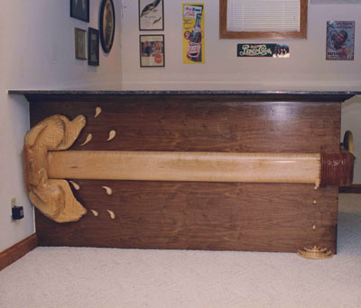
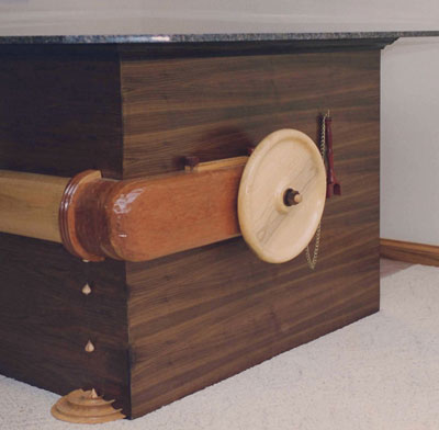
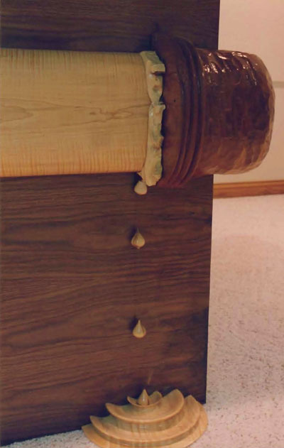
The most difficult aspect to designing furniture is taking it from a conceptual idea to put in the
middle of the floor piece. Just because you think does not mean it can be easily made. If you
have a burning desire to add a large curved section to your dining table, do you have a vacuum
bag or the knowledge to make a form? Will the glued up section stay in place after it is glued or
have some spring back because the individual laminates are too thick (voice of experience
talking here)? What if you want to use three legs for a table instead of the usual four? This could
be done but building a prototype might be beneficial for proper leg placement. I could go into a Turkey
Day bird fiasco but I think you get the idea.
|
|
|
The takeaway here is to, yes, think away from the basic idea of what a table, chair, or even a
stool is. There is nothing wrong with the word "embellish" or the thought of using more than one
type of wood or even material (mixed media I believe is the proper term) for that matter.
Remember, normal or basic is overrated.
A dining room table made from china berry and purple heart:
A pair of end tables made from cherry, curly maple, and purple heart. The end tables have hand forged hooks holding up the round shelves.:
Would you like to see your woodworking in this column? We invite you to
SEND US PHOTOS
of your favorite woodworking projects along with captions and a brief history of your woodworking.
(Email photos at 800x600 resolution.) Receive a $50 store gift card if we show your stuff in a future issue.
Return to
Wood News
front page


